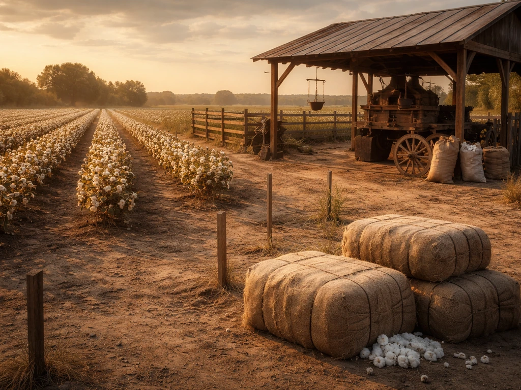
In 1860, the southern United States produced approximately 5,198,077 bales of ginned cotton, with each bale officially defined as 400 pounds. That number comes straight from the published 1860 U.S. Census agriculture report, which remains the gold-standard primary source for this question. If you need a single figure to work with, that is the one to use.
How Much Cotton Did They Grow in 1860? U.S. Census Steps

Samuel Rourke
15 Jun 2026
What does 'how much cotton did they grow in 1860' actually mean?
The phrase is genuinely ambiguous, and unpacking it first saves a lot of frustration. 'They' usually refers to one of three groups: the United States as a whole, a specific region like the Deep South or the Cotton Belt, or a particular state like Mississippi or Alabama. The answer changes a lot depending on which 'they' you mean. Nationally, cotton was essentially a southern crop in 1860, so the U.S. total and the southern total are nearly identical. But if you are trying to map cotton for a specific county or state, you need to drill deeper into the census records rather than stop at the national headline number.
'How much' is equally slippery. It could mean the number of acres planted, the number of bales produced, the total weight in pounds, or the yield per acre. The 1860 census agriculture schedule (Schedule 4) tracks ginned cotton in bales of 400 pounds each as the primary production variable. Acreage figures for cotton do appear in some compiled datasets and later USDA historical series, but they are less consistent across sources than the bale totals. So when people cite '1860 cotton production,' they almost always mean ginned bales, not raw seed cotton or acreage.
Where to find the official 1860 cotton numbers
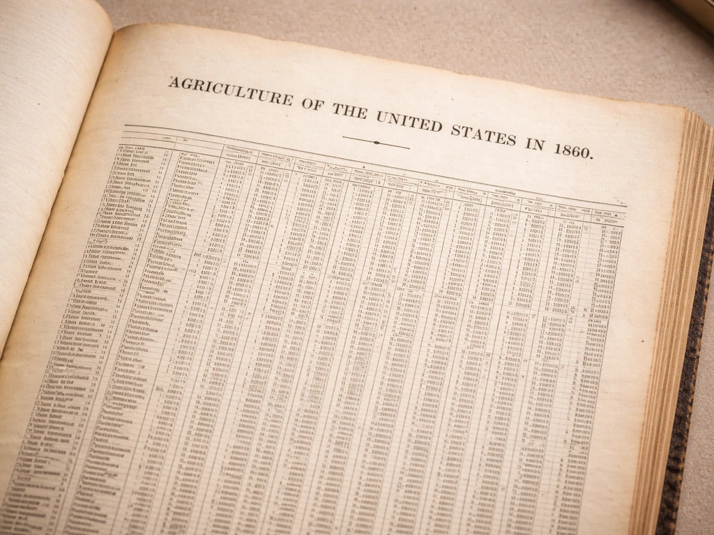
The best place to start is the published report 'Agriculture of the United States in 1860,' produced by the Census Bureau. It is available as scanned PDFs hosted at the Census Bureau's Agriculture 1860 directory, split across multiple part volumes. These volumes contain the state-by-state tables you need, including side-by-side comparisons with 1850 data. If you want the underlying farm-level records rather than the published aggregates, the original agriculture schedules (the handwritten forms filled out county by county) are held by the National Archives. They are available on digital images and microfilm for 1850, 1860, 1870, and 1880, organized by state and then county.
For map-ready data, IPUMS NHGIS (National Historical Geographic Information System) is the most practical tool available today. It provides 1860 census agriculture coverage at the U.S., state, and county levels, sourced from ICPSR datasets. You can download GIS-compatible tables and shapefiles to build choropleth maps of cotton production by county. The 1860 GIS Sandbox on ArcGIS is another resource that has already digitized county-level cotton returns, using the standard 400-pound bale definition, so the layers are directly comparable to the census figures. For a more targeted sample, ICPSR's Southern Farms Study, 1860 (dataset 7419) covers 5,228 farms across 405 major cotton-producing counties, each of which produced over 1,000 bales in 1860.
Acres planted vs. bales produced vs. yield: what each number tells you
These three metrics answer different questions, and mixing them up is the most common mistake in historical cotton research. Here is how to think about each one.
| Metric | What it measures | Best source for 1860 | Typical use |
|---|---|---|---|
| Acres planted | How much land was committed to cotton | USDA historical series, some compiled NHGIS datasets | Comparing land use across regions or years |
| Bales produced (ginned cotton) | Actual harvested output in 400-lb bale equivalents | 1860 Census Schedule 4, published agriculture report | The standard production figure for 1860 comparisons |
| Yield (bales per acre) | Productivity of the land | Calculated from acres + bales; not published directly in 1860 census | Understanding soil quality, labor efficiency, regional differences |
The 1860 census agriculture schedule explicitly records 'Ginned Cotton, bales of 400 lbs. each' as the cotton field, and the data covers produce grown during the year ending June 1, 1860. That means the 1860 figures actually reflect the 1859 harvest season in practice, which matters if you are aligning cotton data with market or weather events from that period. Yield per acre is not a figure the census published directly. To calculate it, you divide bales produced by acres planted, but because acreage data is patchier than bale data, treat yield estimates with some caution unless you can verify both inputs from the same source.
Where cotton was concentrated: a state-by-state breakdown

Cotton was not spread evenly across the South in 1860. It was heavily concentrated in a band of states with the right combination of climate (long frost-free growing seasons), soil (especially the fertile alluvial soils along major river systems), and labor supply. The published 1860 agriculture report provides state-level bale totals, and the pattern is striking.
| State | Approximate 1860 ginned cotton (bales of 400 lbs) | Notes |
|---|---|---|
| Mississippi | ~1,200,000 | Largest single producer; Delta region was exceptionally productive |
| Alabama | ~990,000 | Second largest; Black Belt soils drove high output |
| Georgia | ~700,000 | Strong Piedmont and coastal plain production |
| Louisiana | ~778,000 | River access made it a major export conduit as well as producer |
| South Carolina | ~353,000 | Earlier dominance had faded; upcountry and Sea Island cotton still significant |
| Tennessee | ~296,000 | Western Tennessee was the productive cotton zone |
| Arkansas | ~367,000 | Rapidly expanding in 1860; river bottomlands being cleared |
| Texas | ~431,000 | Fast-growing frontier cotton state in 1860 |
| North Carolina | ~145,000 | Smaller share; primarily Piedmont production |
| Florida & Virginia | Smaller amounts | Marginal cotton producers relative to Deep South states |
Mississippi and Alabama together accounted for roughly a third to two-fifths of all southern cotton output. The Mississippi River and its tributaries were not just geographic features; they were the arteries that made high-volume cotton farming economically viable in interior regions like the Delta and the Arkansas and Louisiana lowlands. States with poor river access, like parts of North Carolina and Georgia's mountain counties, produced far less cotton even where soils were adequate.
Why 1860 cotton looked the way it did: labor, ginning, markets, and demand
You cannot understand the 1860 cotton map without understanding the labor system that produced it. The overwhelming majority of cotton in the South was grown using enslaved labor. Large plantations in Mississippi, Alabama, Louisiana, and Georgia could cultivate hundreds of acres of cotton precisely because they had no labor costs in the modern sense. This is not a footnote; it is the central explanation for why cotton output was so heavily concentrated in specific states and counties. The counties with the highest bale totals were almost always the counties with the highest enslaved populations.
Ginning technology mattered too. The cotton gin, by 1860 a well-established technology, had transformed what was once an enormous hand-labor bottleneck into a mechanized step. Planters near ginning facilities could process far more raw seed cotton into the ginned bales counted in the census. This is also why the census field is specifically 'ginned cotton': the bale figure reflects processed, market-ready output, not the raw weight pulled from the field. Areas with more gins and better access to them show up with higher production figures relative to acreage.
Market demand drove the expansion into new states like Texas and Arkansas during the 1850s. British textile mills, particularly in Lancashire, were consuming American cotton at an enormous rate, and prices had been strong through much of the decade. That demand signal encouraged planters to push into new land rather than intensify production on existing fields, which is why you see such rapid expansion in frontier cotton states by 1860. Transportation infrastructure, primarily river systems and the early rail network, determined which new areas could actually get their bales to market in time to profit.
How to cite sources and sort out conflicting cotton totals
Different publications sometimes report slightly different 1860 cotton figures, and the differences are usually explainable rather than mysterious. The most common sources of variation are bale-weight definitions, rounding conventions, and whether a source is using the original census tabulation or a later compiled estimate.
- Anchor your primary citation to the published 1860 agriculture report: 'Agriculture of the United States in 1860,' compiled by the Census Bureau. This is the authoritative published source and should be your baseline.
- Note the bale definition explicitly. The 1860 census and later statistical abstracts (including the 1910 Historical Statistics edition) use 'equivalent bales of 400 pounds each.' If a secondary source uses a different bale weight (some later compilations used 480-lb bales), that alone can create apparent discrepancies of 10 to 20 percent.
- Cross-check against NHGIS datasets if you are working at the county or state level. NHGIS sources its data from ICPSR parts 9, 10, and 46, which are derived from the original census schedules. If your NHGIS figure matches the published report, you can be confident you are working from the same underlying source.
- Be cautious with USDA historical series and other compiled datasets. They are useful for long time-series comparisons but sometimes reprocess census data using adjusted bale weights or acreage estimates. Always check the footnotes for their bale-weight assumption.
- If you are using the ICPSR Southern Farms Study (dataset 7419), remember it covers only 405 major cotton-producing counties, not the entire South. It is a sample, not a full tabulation, so its totals will be lower than the census aggregate.
- For academic citation, the National Archives microfilm or digital image of the original Schedule 4 returns is the primary source. The published agriculture report is a secondary (but official) aggregation of those returns.
When two reputable sources disagree, the practical approach is to report both figures and explain the likely source of the difference (bale-weight definition, sample vs. full census, year of harvest vs. year of report). Citing the bale-weight assumption explicitly in any table or map legend eliminates the most common reader confusion.
Turning the 1860 cotton data into a mapped crop history takeaway
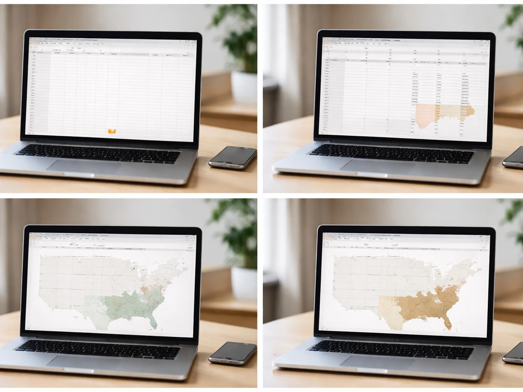
If your goal is to map where cotton grew in 1860, which is exactly the kind of historical crop geography this site is built around, here is the most practical workflow. Download the county-level 1860 agriculture tables from NHGIS, select the ginned cotton bales field, and join it to the 1860 county boundary shapefiles that NHGIS also provides. You will immediately see the Cotton Belt emerge as a geographic pattern: a dense crescent of high production running from South Carolina through Georgia, Alabama, Mississippi, and Louisiana, with a second lobe extending into western Tennessee, Arkansas, and eastern Texas.
That map pattern is not arbitrary. It traces the combination of warm, humid climate with at least 200 frost-free days, fertile soils (especially river alluvium and the Black Belt limestone soils of Alabama and Mississippi), and river access for moving bales to port. If you overlay that 1860 cotton map with modern climate data or soil surveys, the continuity is striking: most of the counties that led cotton production in 1860 are still in cotton-growing regions today, even though acreage and yields have shifted dramatically.
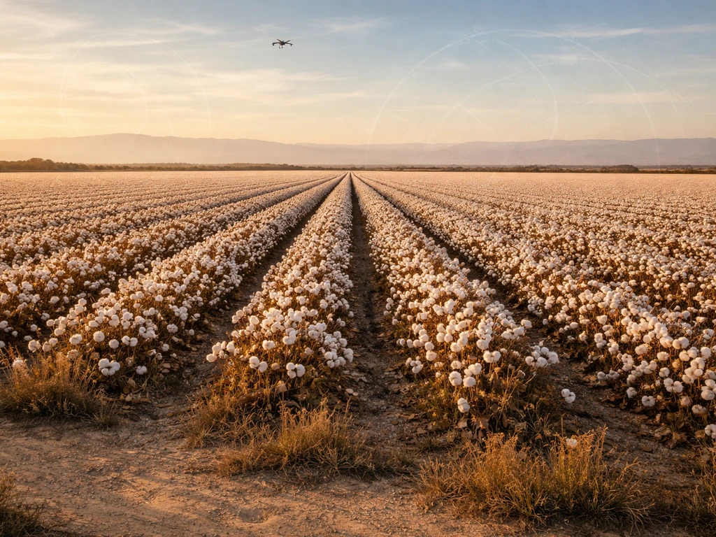
For a location-specific takeaway, pull the bale total for your county of interest from NHGIS or the published census report, note whether that county was above or below the regional average, and then check what river, railroad, or road connected it to a ginning facility and shipping point. Photo imagery from farm records and landscapes can help you interpret how those soil, climate, and transportation factors shaped cotton outcomes in California. That triangle of soil, climate, and transportation access explains almost every county-level variation you will find in the 1860 cotton data. Comparing your county's 1860 total with its modern cotton acreage also reveals whether that region stayed in cotton or shifted to other crops as labor and mechanization costs changed after the Civil War.
Cotton's deep roots in U.S. agricultural history connect to broader questions worth exploring further, including where cotton cultivation originally spread from and which regions or countries pioneered it as a commercial crop. Those threads lead naturally into the geography of cotton's origins and its global spread, which give useful comparative context for understanding why the American South dominated world production in 1860 the way it did. Was cotton the first plant to grow on the moon, and how do we know? In cotton’s early history, Egypt is often cited as one of the first countries to cultivate and expand cotton production first country to grow cotton which was the first country to grow cotton.
FAQ
If the question is “how much cotton did they grow in 1860,” does “they” mean the whole U.S. or only the Cotton Belt?
It depends on whether you mean the U.S. total, the “South” total, or a specific state or county. In practice, most people asking this question are looking for the U.S.-level ginned cotton production in bales (400 lbs each), which is why the national and southern totals end up very close in 1860.
Should I use ginned cotton bales, acres planted, or seed cotton weight when answering how much cotton was grown in 1860?
The main census production number is ginned cotton in bales of 400 lbs each, not seed cotton weight pulled from fields. If you try to convert to pounds, convert bales by multiplying by 400, but do not mix in compiled series that may use different rounding or bale-weight conventions.
Does the 1860 census cotton figure refer to the harvest year or the calendar year 1860?
The census agriculture schedule records cotton produced for the year ending June 1, 1860. So if you are correlating cotton output with events like weather or prices, line up your interpretation to that June-1 reference rather than assuming “calendar year 1860” in the usual modern sense.
Can I calculate cotton yield per acre for 1860 from these data, and what goes wrong most often?
If you compute yield per acre, make sure the acres you use come from the same source and the same reporting concept as the bale totals. Because acreage inputs are less consistent across compiled datasets than the bale totals, yield estimates can become unstable unless both sides of the calculation are matched carefully.
What is the correct way to map county cotton production in 1860 without mismatching boundaries?
County mapping works best when you pull the county’s bale total directly from the 1860 county-level agriculture tables, then join to county boundary shapefiles from the same geographic system. If you join to modern county boundaries or change geographies midstream, the totals may still be correct but your map location can be misleading.
Why do different publications sometimes give slightly different “1860 cotton” numbers?
Some disagreements between sources come from whether they use the original census tabulation versus later rework, and from how bale weight or rounding is handled. When two reputable sources differ, report both and include a note stating the bale-weight definition and whether the figure is tabulated directly or re-estimated.
How can I be sure I selected the right variable (ginned bales) in a dataset or spreadsheet?
If you are using a GIS or compiled dataset, verify that the cotton field you select is explicitly “ginned cotton, bales of 400 lbs each.” Selecting an acreage variable or a differently defined cotton metric can silently change the meaning of your map, especially in datasets that include multiple agriculture fields.
If my county’s cotton production looks “off” compared with neighboring areas, what practical checks should I run?
A county’s cotton output was often shaped by access to gins and transportation to shipping points, not just how suitable the land was. If you see unusually high or low bale totals for a county, check nearby river routes, rail connections, and whether ginning facilities would have been accessible enough to process raw seed cotton into counted bales.
Will the answer change if I aggregate by state versus a custom “Cotton Belt” definition?
Yes, the geography can shift depending on whether you aggregate by state, by “southern” region, or by river basin or cotton belt definition. The overall pattern stays clustered in the core Cotton Belt, but your totals and the shape of the high-production zone can change if your aggregation rule changes.
What should I label in my table or map legend so readers don’t misinterpret the numbers?
To avoid the most common confusion, state your unit and definition explicitly in your output. For example, say “ginned cotton bales (400 lbs each) for the year ending June 1, 1860.” That single sentence prevents readers from assuming acres planted or seed cotton weight.
Next Articles
How Photo Imagery Helps California Farmers Grow Cotton
Step by step guide to use satellite, drone, and field photos to spot stress, map water needs, and boost cotton yields in

Where Did Cotton First Grow? Early Cultivation Regions
Find the first cotton cultivation regions by species, with key archaeology and a map-based method to verify origins.
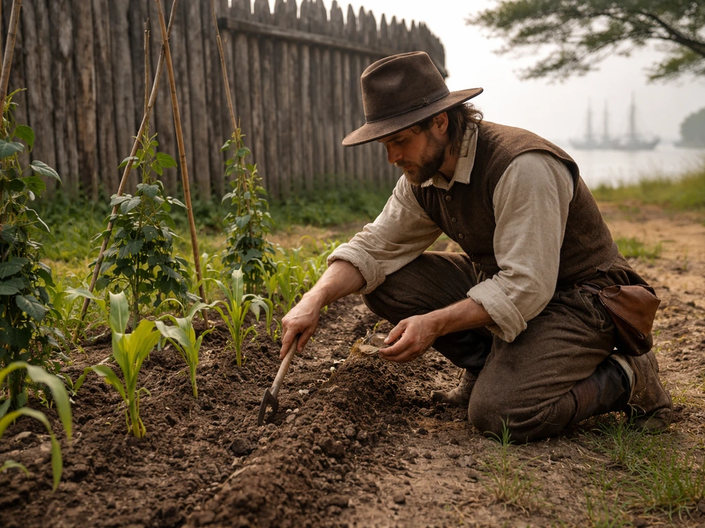
What Did Jamestown Grow and How They Farmed It
Learn what Jamestown colonists grew and the methods they used to plant, harvest, and adapt crops to Virginia conditions.