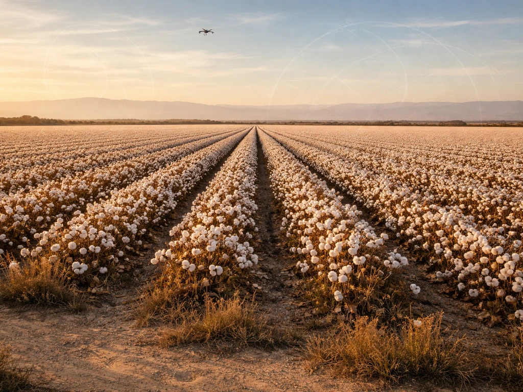
Photo imagery helps California cotton farmers catch problems earlier, water smarter, and treat only the parts of a field that actually need it. Whether you're pulling free Sentinel-2 scenes every five days or flying a drone at first light, the images give you a visual record of how every acre is performing, right now and compared to last season. In fact, questions like “was cotton the first plant to grow on the moon” come up often in space-agriculture discussions. The practical payoff is real: fewer inputs wasted on healthy areas, faster response to stress before it cuts yield, and a season-long map of your field you can actually learn from.
How Photo Imagery Helps California Farmers Grow Cotton

Samuel Rourke
11 Jun 2026
Cotton in California: where it grows and when it matters
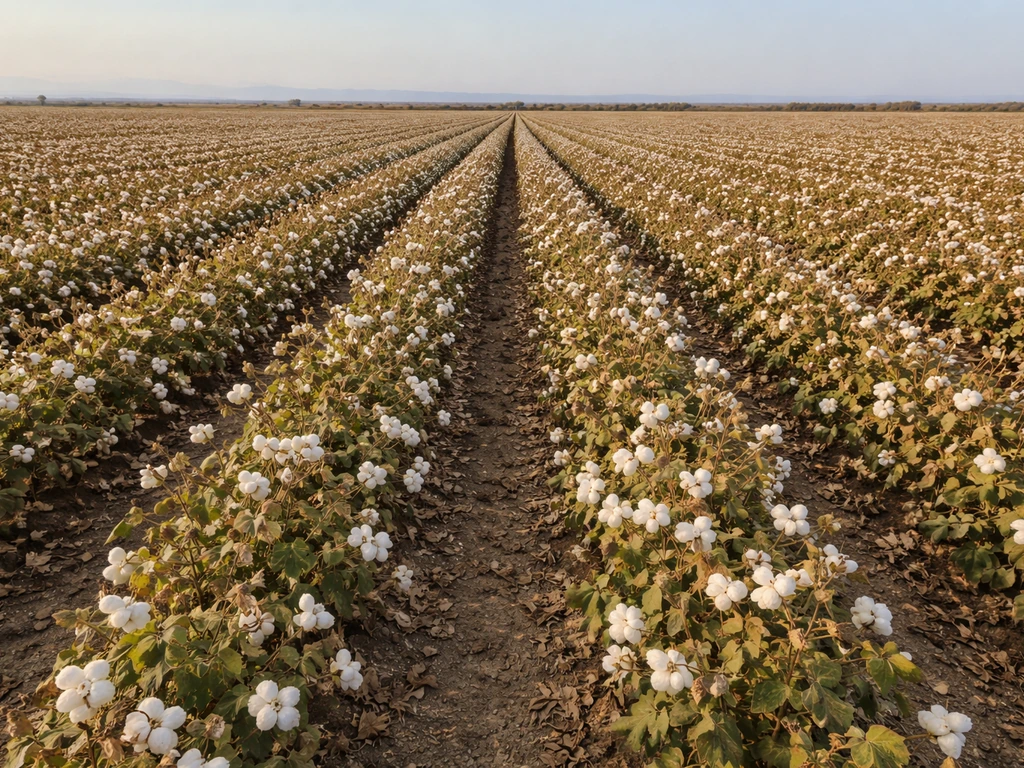
California cotton is concentrated in the San Joaquin Valley, particularly in Kern and Tulare counties. USDA-NASS county estimates confirm these two counties consistently account for the bulk of California's acreage and production, and they show up together in USDA's District 50 ginning reports. To put those modern patterns in context, historical records can also show how much cotton was grown in 1860 bulk of California's acreage and production. The climate there is ideal for Upland and Pima cotton: long, hot summers with low humidity, very little rainfall during the growing season, and reliable sunshine. What makes it challenging is the same thing that makes it possible, almost all water has to be supplied by irrigation, and heat events can come fast.
The season runs roughly from late April planting through October harvest. Emergence and stand establishment happen in May, squaring begins around late June, peak bloom is July, and boll development carries through August and September. Each of those stages has different imagery priorities, which is why timing your image collection to the crop calendar matters more than just grabbing whatever scene happens to be cloud-free.
What 'photo imagery' actually means for cotton production
The phrase covers everything from a snapshot you take on your phone walking rows to multispectral satellite data downloaded from a government archive. For practical cotton management, there are four categories worth knowing.
| Imagery Type | Spatial Resolution | Revisit Frequency | Best Use in Cotton |
|---|---|---|---|
| Landsat 8/9 (free, USGS) | 30 m multispectral, 15 m pan | 8-day combined revisit (16-day per satellite, offset) | Season-long NDVI time series, field-level trend tracking |
| Sentinel-2 (free, Copernicus) | 10 m (key bands), 20 m others | ~5-day revisit with two satellites | Stand uniformity, vigor mapping, stress detection at field-block level |
| Drone/UAV (multispectral or thermal) | Sub-5 cm to 30 cm typical | On-demand | Row-level stand counts, irrigation uniformity, pest hotspots, canopy temperature |
| Ground-level / in-field photos | Point-level | Any time | Scouting confirmation, pest ID, canopy condition documentation |
Landsat's 30-meter multispectral bands are processed into Surface Reflectance products (Collection 2) with atmospheric correction and cloud quality flags, making them reliable for comparing one date to another. Sentinel-2 bumps that resolution to 10 meters across four key bands with atmospheric correction applied via Sen2Cor, which also outputs cloud and shadow probability so you know which pixels to trust. Neither satellite costs anything to access, which makes them the logical starting point for any California cotton operation.
Drone imagery takes you to a different level of detail entirely. A multispectral UAV can resolve individual rows, and a thermal UAV can map canopy temperature across a field in a single morning flight. That thermal data is what drives crop water stress index (CWSI) calculations, a proven approach for detecting irrigation deficits in cotton canopies before the plants visibly wilt. Ground photos anchor everything by confirming what the pixels are actually showing you, a red zone on a drone map means nothing until you walk it and see whether you're looking at spider mites, a broken drip emitter, or a soil texture change.
Crop scouting and irrigation management: turning images into decisions
Stand counts and emergence uniformity
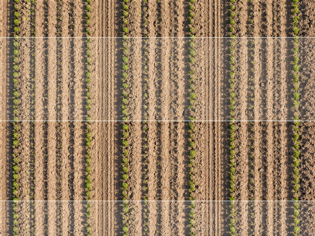
The first useful flight of the season is a low-altitude drone pass around two to three weeks after planting, before canopy closure makes row-level counting hard. At 10 to 30 cm resolution you can count emerged plants per row foot and flag skip zones. Patchy emergence can reflect seed placement issues, soil crusting, or variable seedbed temperature, and knowing the pattern early lets you decide whether to replant sections or adjust irrigation to improve germination in marginal areas.
Irrigation scheduling and water stress detection
Thermal UAV imagery is the most direct tool for irrigation management in cotton. Stressed plants transpire less, so their canopy temperature rises above well-watered plants. Research using high-resolution UAV thermal imagery has demonstrated that the spatial pattern of canopy temperature accurately maps where water stress is occurring within a field, often showing clear gradients that follow irrigation system geometry. CWSI values from thermal imagery have been validated against yield predictions in cotton, giving you a stress map you can actually act on by adjusting irrigation zones or run times.
Satellite-derived NDVI from Sentinel-2 (10 m) complements thermal data by tracking overall canopy vigor over time. A field that is greening up evenly by squaring but shows a persistent low-NDVI strip along one lateral line is telling you something is wrong with that lateral, before you see wilting. NDVI is computed from red and near-infrared reflectance, so it picks up chlorophyll-related greenness rather than just water status, making it a useful cross-check against thermal stress signals.
Catching stress early: pests, disease, nutrients, and heat
Most stress in cotton shows up spectrally before it shows up visually, which is the core argument for using imagery rather than waiting to see something wrong on a field walk. The earlier you detect it, the more options you have.
Pest pressure
Imagery does not identify a pest, it identifies where something is reducing plant vigor or canopy health. The UC IPM program sets a bollworm and budworm treatment threshold of 10 to 12 small larvae per 100 plants. Imagery can help you prioritize where to scout by flagging low-vigor zones that are worth walking first. A drone NDVI map from mid-July showing scattered low-vigor patches in a uniform field is a cue to go check those spots for bollworm, lygus, or spider mite infestations. You still need to scout and count, but you're scouting smarter.
Nutrient deficiency
Nitrogen deficiency is detectable via remote sensing earlier than many growers realize. USDA-ARS research has shown that red-edge and chlorophyll-related indices, particularly NDRE and similar metrics, detect nitrogen deficiency in cotton before standard NDVI responds. The red-edge band in Sentinel-2 (Band 5, 20 m resolution) is directly useful here. If your field shows declining NDRE values in July before you expect visible yellowing, it is worth a petiole test to confirm nitrogen status and decide whether a fertigated application makes sense.
Water and heat stress
Thermal remote sensing for cotton water stress has solid research support going back to the late 1990s and has been validated with modern UAV platforms. During peak bloom and boll fill in July and August, when San Joaquin Valley temperatures can run above 100°F for days at a stretch, canopy thermal imagery taken in the morning gives you a stress map you can use to adjust afternoon irrigation before the next heat event. Pairing a Sentinel-2 NDVI time series with weekly drone thermal flights during this window gives you both the broad field pattern and the row-level spatial detail.
Yield and quality gains through zoned management
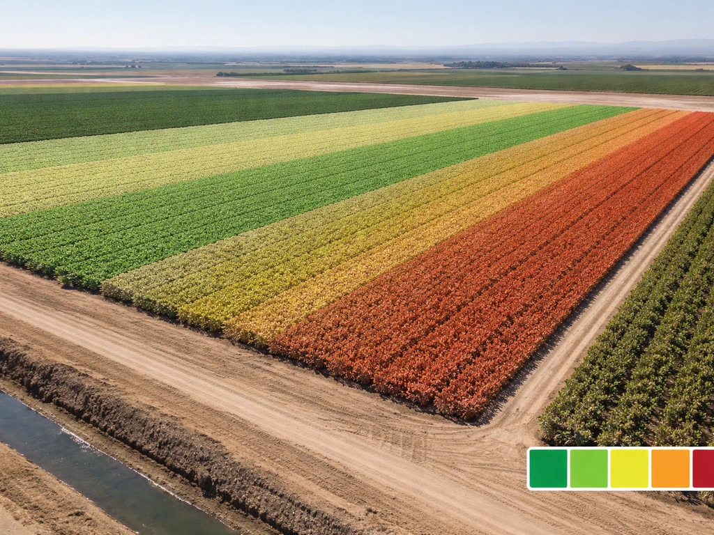
Treating an entire 200-acre field the same way because the corners look fine is one of the most common sources of inefficiency in California cotton. Imagery lets you divide a field into management zones based on consistent patterns of performance, then apply inputs, water, fertilizer, growth regulators, at the zone level rather than the field level.
The workflow is straightforward. Stack three to five Sentinel-2 NDVI scenes from a single season (emergence, squaring, bloom, boll fill) and run a simple zone classification, even a manual color-range threshold in free tools like QGIS works. Zones that consistently underperform across multiple dates are your problem areas. Zones that consistently outperform are your benchmarks. From there you adjust irrigation run times or fertilizer rates by zone rather than by field, and you track whether the intervention closes the gap in the following season's imagery.
Field boundary mapping is part of this too. Tools like USDA's Cropland Data Layer (accessible through CropScape) use annual satellite-derived crop cover data to confirm which parcels are in cotton in a given year, which matters if you're managing multiple blocks or trying to compare your fields against regional patterns. CDL snapshots are annual and derived from growing-season satellite imagery, so they give you a regional-scale confirmation of cotton distribution that complements your field-level data.
Reading patterns across seasons and history
One of the most underused aspects of freely available satellite data is the depth of the archive. Landsat Collection 2 Surface Reflectance products include data going back decades, and the consistent atmospheric correction makes cross-year NDVI comparisons genuinely meaningful. If you want to know whether a block in your field has always performed below average, you can check. If you want to understand whether drought years in California consistently produce specific spatial patterns of cotton stress in Kern County, the data to ask that question exists.
This seasonal and historical perspective connects directly to the larger question of why cotton grows where it does. It also helps to understand which was the first country to grow cotton and how early cultivation spread over time why cotton grows where it does. You can also trace the origins of U.S. cotton by asking where cotton first grew and how those early regions shaped later production. The San Joaquin Valley's cotton history is tied to water infrastructure, climate suitability, and market access, factors that show up in regional land-use data and satellite-era imagery alike. Comparing current NDVI maps to imagery from prior dry years can reveal which parts of a field are most sensitive to water supply constraints, which is exactly the kind of information you want before a forecasted dry year hits. That same comparative lens is useful for students and researchers tracing how cotton cultivation has shifted within California over decades, mirroring the broader story of where cotton has historically grown and why some regions sustain it while others do not.
Your first steps today: what to collect and when
If you are starting from scratch in mid-June 2026, here is a practical sequence for the rest of the season.
- Pull your field boundaries into QGIS or Google Earth Engine and download the last three available Sentinel-2 Level-2A scenes (atmospheric-corrected, cloud-screened). Calculate NDVI for each and overlay them. You now have a baseline vigor map for the current season.
- If you have access to a multispectral drone, fly a stand-uniformity pass now if you have not already—canopy closure in cotton happens fast and you want row-level data before it is gone.
- Set a calendar reminder to pull a new Sentinel-2 scene every 10 to 14 days through October. The two-satellite revisit is roughly five days, but cloud cover in summer is generally low in the San Joaquin Valley, so usable scenes come in reliably.
- Schedule at least two thermal drone flights during peak bloom and boll fill (late July and mid-August). Use those to map canopy temperature and calculate CWSI before the worst heat windows.
- Walk the low-NDVI zones you identified in step one. Photograph what you find and note GPS coordinates. That ground truth is what keeps your imagery interpretation honest.
- At season end, archive all your scenes and field notes in a dated folder. Next April, compare your emergence imagery to this year's baseline—that comparison will tell you more about your field than any single-date image ever will.
The tools that make this possible, Sentinel-2 data, Landsat archives, free GIS software, are all accessible right now at no cost. The investment is time and consistency, not equipment. Once you have two or three seasons of imagery stacked, you will have a field record that improves every decision you make.
FAQ
If imagery flags a stressed area, how do I know whether it is a real yield threat or just a false signal?
Start with a single “ground truth” visit right after you see a problem signal on imagery. For satellites, confirm with at least 5 to 10 stops across the lowest-NDVI zone and a matched control area, then adjust your scouting route so you are not treating the entire field as if it is uniformly stressed. This is especially important because NDVI can be affected by residue cover, not just plant health.
How should I decide whether low NDVI is nitrogen deficiency, water stress, or a pest problem?
Use imagery for detection, then rely on field sampling for diagnosis. Create a simple decision tree: thermal and NDRE patterns that persist across multiple dates suggest nitrogen or water constraints, while a sudden change confined to a small patch often points to pests or localized equipment issues. Then confirm with a petiole test for N, and live scouting counts for insects before you apply targeted inputs.
When is the best time of day (and the worst timing) to capture UAV thermal images for CWSI?
Plan thermal flights around stable conditions, typically early morning when plant water stress differences are most detectable and before midday heat scrambles canopy temperatures. Also avoid flights right after irrigation events, because canopy temperature can lag water status, creating misleading gradients. If you can, schedule one flight before irrigation and one after, for the same zone.
Can I use only satellite imagery, or do I really need drones to make cotton irrigation decisions?
Yes, but calibrate expectations. Sentinel-2 gives a broad, 10 m view that is great for zoning and trend tracking, while drones can resolve rows but cover only part of a field per flight. A practical approach is Sentinel-2 to define zones and prioritize scouting, then drone thermal or drone multispectral to refine within those zones.
What should I do if the satellite images look inconsistent from one date to the next due to clouds or shadows?
Cloud probability and shadows can bias results even with quality flags. If you see abrupt “health jumps” from one date to the next, check the scene’s cloud and shadow masks and prefer dates where the problem zones have high-confidence pixels. Keeping a time series across multiple dates reduces the chance that one bad scene drives your conclusions.
How many image dates are enough to make zoning decisions instead of chasing short-term fluctuations?
You do not need a huge time series to start, but you do need enough dates to separate noise from patterns. For zoning decisions, 3 to 5 well-timed images across key growth stages is a practical minimum, then validate in the same season with a few row-level checks. For historical comparisons, add more years from the Landsat archive to see whether a pattern is stable across drought and wetter years.
How do I avoid mixing up cotton with other crops or bare soil when creating management zones?
Treat boundaries carefully, especially if your blocks have similar crops or if you have irregular edges. Use field boundary mapping tools to confirm parcels are cotton, then compare imagery-based zones to on-the-ground landmarks. If your problem zones consistently shift when boundaries change, you likely need to refine your field polygon rather than change your agronomy inputs.
What is the most common mistake when turning imagery into an actionable zone map?
Do not run classification on a single index layer. If you use NDVI only, you can miss stress that is not yet greening up or that is masked by residue. A stronger workflow is to combine thermal stress signals with NDVI time trends and, when relevant, NDRE for nitrogen. This reduces the chance you “overcorrect” for nitrogen when the primary issue is irrigation timing.
How long after changing irrigation or fertilizer should I expect imagery to show an improvement?
Expect management changes to show up over different timescales. Irrigation timing and run time often influence canopy temperature within days, while nitrogen response in cotton is typically slower, showing up more clearly over subsequent growth stages. Build your zone evaluation window around the crop calendar, then compare imagery in the next scheduled stage rather than the next day.
What if I start using imagery late in the season and I miss early growth-stage data?
If you are starting mid-season, you can still build value by focusing on the remaining high-impact windows (for example, bloom and boll fill) and using imagery primarily for zoning and scouting prioritization. For missing emergence data, rely more on drone row-level counts in the next practical window and use satellite NDVI trends to establish benchmarks against better-performing zones.
Next Articles

Where Did Cotton First Grow? Early Cultivation Regions
Find the first cotton cultivation regions by species, with key archaeology and a map-based method to verify origins.
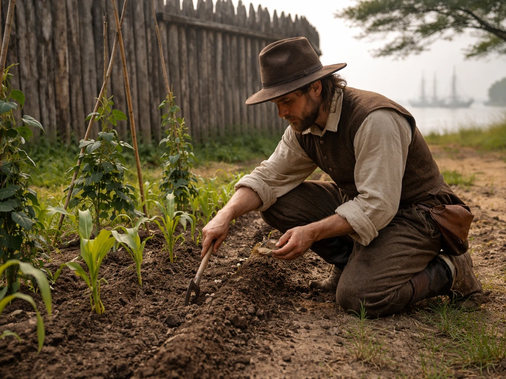
What Did Jamestown Grow and How They Farmed It
Learn what Jamestown colonists grew and the methods they used to plant, harvest, and adapt crops to Virginia conditions.
What Did the New England Colonies Grow? Major Crops
Major New England colonial crops explained by climate and soil, from corn and wheat to beans and hay, plus today’s paral